Responsive Web Design: 50 Examples and Best Practices
The number of handheld devices operating worldwide is growing exponentially. According to stats, more than 90% of adults own a cell phone, whereas almost 50% of smartphone users admit that they could not live without their devices. What can we say; the mobile web is a huge thing these days. That why in this post we write about responsive web design and show some good examples from the industry.
On the one hand, it is a good thing since we have an opportunity to address issues quickly and efficiently, locating information on the spot. On the other hand, this reality has created a challenge for all those who provide users with information.
The deal is, in the late 2000s, serving information for users was a piece of cake. You just needed several versions of the same website: one for mobile phones, the other one for desktops. However, in the 2020’s we cannot commit to supporting each new user agent with its own bespoke experience since each year, we witness new dimensions and screen sizes.
Creating styles for each screen size is time-consuming, resource-consuming, and expensive. Even if you manage to cover all the breakpoints in the World, this will seriously overload the website and ipso facto decrease performance that drastically worsens conversions and user’s engagement with the brand, to say nothing about investing lots of money without decent ROI. So, how can entrepreneurs avoid this fate and successfully meet the fast-changing realms of digital expanses? The answer is simple – adopt responsive design.
Investing in a website whose pages are responsive and accessible, regardless of the browser, platform, or screen that your reader must use to access, is the only way to stay afloat these days. Responsive web design is no longer a tendency; it is a standard that we need to enforce to make the web a better place.
Let us take a moment to walk through the essentials of a responsive website to understand better why it is important and what you need to do to ensure your site responds to the device’s capabilities it is viewed on perfectly to let users enjoy the excellent visual experience.
What is Responsive Web Design?
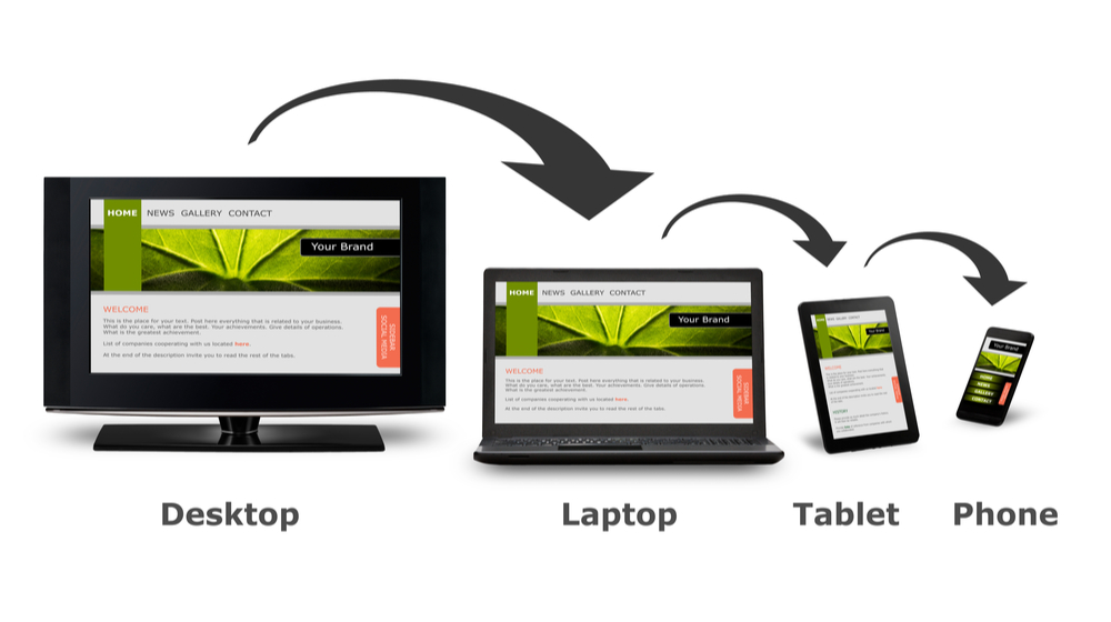
So, what is a responsive website? What does it look and feel like?According to Wikipedia, responsive web design is an approach that ensures all the pages of the website look, work and feel perfectly on any device. Whether it is a tiny old cell phone with a screen width of 320px, a modern phablet with 7 inches screen, a big iPad, or a TV with a massive diagonal line, all the main aspects such as content, design, and especially functionality should perform consistently to provide users with an excellent user experience.
In technical terms, responsive web design implies a set of instructions that help web pages change their layout and appearance to meet different screen widths and resolutions.
The concept of a responsive website appeared due to non-effective and ill-suited ways of handling screen sizes. Originally, pages were built to target a particular device. This approach implied creating a range of designs for each responsive tier resulting in different versions of the same page. However, with the mobile web becoming a reality and more and more devices with non-standard resolutions appeared, this approach has quickly become irrelevant since it could not handle this variety efficiently.
In the early 2010s, largely thanks to a gifted Ethan Marcotte, developers started to switch from popular adaptive design (an approach that implied creating several versions of one design) to responsive design (an approach that suggested only one yet flexible version of a website that stretched or shrunk to fit the screen). Although that technique was pretty new and untested, nevertheless its benefits were hard to ignore. Even now, those advantages prove to everyone that a responsive website is the only way out. Let us consider them.
Benefits of Responsive Web Design The main benefits of using a responsive website are
consistent visual experience; better user experience; no need for redirects; lower bounce rates; lower maintenance needs; high web page loading speed; no extra fees for creating and maintaining different versions; easy analytics reporting. Even though responsive design is not flawless, it has its cons, for example, It is not fully optimized; It can slow performance; It may suffer from web browser incompatibility; It makes it challenging to run advertising campaigns; It makes it challenging to offer different things to different users depending on the device used; Nevertheless, it had and has significant advantages over other solutions. Therefore, nowadays, responsive web design is a standard for websites.